In the world of web and graphic design, typography plays a crucial role in creating visually appealing and effective designs. One of the most powerful tools at a designer’s disposal is Google Fonts, a free library of over 1,000 font families. However, with so many options available, choosing the right font combinations can be overwhelming. This guide will help you master the art of pairing Google fonts to create stunning designs that captivate your audience.
Why Font Pairing Matters
Before diving into specific font combinations, it’s important to understand why font pairing is so crucial:
- Visual Harmony: Well-paired fonts create a cohesive look that enhances your overall design.
- Readability: Proper font pairing improves the legibility of your content across different screen sizes and devices.
- Brand Identity: Consistent font pairings help establish and reinforce your brand’s visual identity.
- Emotional Impact: Different font combinations can evoke specific emotions and set the tone for your design.
Principles of Effective Font Pairing
- Contrast is Key When pairing fonts, look for contrasting styles that complement each other. For example, pair a bold sans-serif header font with a more traditional serif font for body text.
- Stick to 2-3 Fonts Using too many fonts can make your design look cluttered and unprofessional. Aim to use no more than 2-3 fonts in a single design.
- Consider Font Weights Experiment with different weights within the same font family to create hierarchy and visual interest.
- Match the Mood Choose fonts that align with the overall tone and purpose of your design.
Top Google Font Pairings for Web and Graphic Design

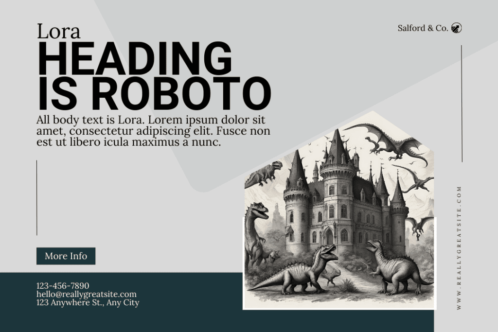
- Roboto + Lora
- Roboto (sans-serif) for headings
- Lora (serif) for body text
This combination offers a modern, clean look with excellent readability.

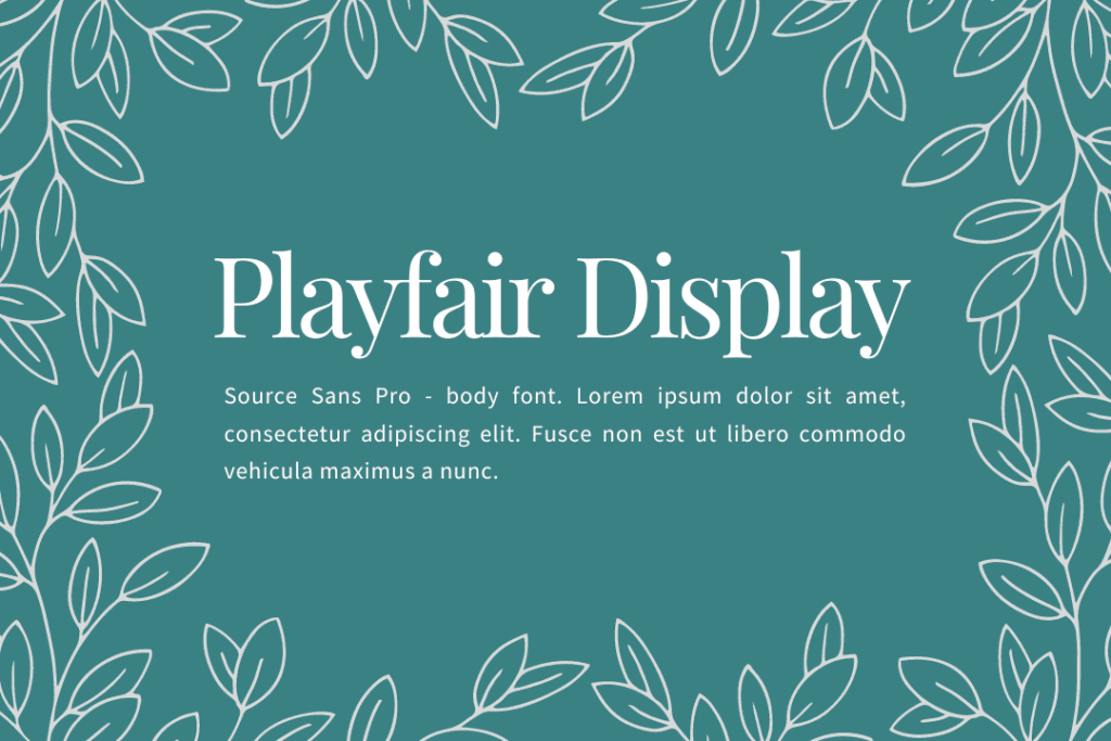
- Playfair Display + Source Sans Pro
- Playfair Display (serif) for headings
- Source Sans Pro (sans-serif) for body text
A classic pairing that balances elegance with simplicity.
- Montserrat + Merriweather
- Montserrat (sans-serif) for headings
- Merriweather (serif) for body text
This combo creates a strong contrast while maintaining a professional appearance.
- Oswald + Open Sans
- Oswald (sans-serif) for headings
- Open Sans (sans-serif) for body text
A versatile pairing that works well for both modern and traditional designs.
- Lato + Merriweather
- Lato (sans-serif) for headings
- Merriweather (serif) for body text
This combination offers excellent readability and a clean, professional look.
Tools for Exploring Google Font Pairings
To help you discover and experiment with different font combinations, consider using these helpful resources:
- FontPair offers a curated selection of Google Font pairings, complete with visual examples and easy-to-use filters.
- Canva Font Combinations. Canva provides a comprehensive guide to Google Font pairings, including tips on how to use them effectively in your designs.
- Google Fonts. The official Google Fonts website allows you to browse, compare, and test different font combinations in real-time.
Tips for Implementing Google Fonts in Your Designs
- Test on multiple devices to ensure readability across different screen sizes.
- Consider loading times and optimize your font choices for better performance.
- Use font variants (like italics and bold) to create a hierarchy within your design.
- Experiment with font sizes to create visual interest and improve readability.
- Don’t be afraid to mix serif and sans-serif fonts for added contrast.
Conclusion
Mastering the art of pairing Google fonts can significantly elevate your web and graphic designs. By following the principles outlined in this guide and exploring the recommended tools and resources, you’ll be well on your way to creating stunning, typography-driven designs that capture attention and effectively communicate your message.
Remember, practice makes perfect. Don’t be afraid to experiment with different combinations and trust your eye for what looks visually appealing. With time and experience, you’ll develop an intuitive sense for creating beautiful font pairings that enhance your designs and delight your audience.


